By Chrystall Kanyuck
After the first serious “visuals” brainstorm of the Latinos in the Military project — with Andrew Long, Jason Manning and N21 fellows Chris Cameron and myself (Chrystall) — I’m thinking a lot about data, and how data tells a story.

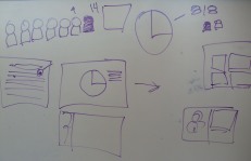
White-boarding our thoughts on data visualization... The final product will be a little more polished.
When I think and read about data visualization, it’s mostly about the aesthetics of the information and the way the user navigates through the information. As much as we want our data to look nice and be user-friendly, our story lends itself particularly well to what I think is a next step for journalism — a marriage of data visualization and narrative storytelling.
One way we might do this is to invite people into the narrative stories — videos in our case — with pieces of data. For example, the user could enter a page that says there are 1.1 million Latino veterans, then they see a million little dots representing the people, and then a few people pop up to represent the specific veterans in our story. This part might look a little like the ‘Did You Know?’ video we (at ASU at least) all love so much.
Another way we’re thinking about the marriage of data and narrative is in relation to Faces of the Fallen. WashingtonPost.com shows us essential stats of all the folks that have died in the current conflicts, which is powerful because of its scale. Our approach might be an inverse of that; going much deeper with far fewer people.
Inspiration is on its way. I can feel it.

